SMOTE Visualization, for (Data) Science!
My bus ride to and from the Limnu office is about half an hour each way. I like to spend that time listening to podcasts. I like all kinds of them: science, comedy, news, arts, startup advice (natch), and everything in between.
I recently started listening to Linear Digressions hosted by Katie Malone and Ben Jaffe, and it's already one of my favorites. They talk about data science and machine learning, and they present it in a very approachable way.
Whoa, hang on! I know some of you saw that previous paragraph and thought "well, that's not for me". Bear with me for a minute: it's not as scary as it sounds, it's actually pretty cool. And this post ends with a photo of some amazing coastlines. Stick around, this will be fun!
What is SMOTE?
In a recent episode, Ben and Katie talked about an algorithm called SMOTE. Part of SMOTE is creating new, similar data from existing data. I'm not going to dig into why it's needed or when to use it; Katie and Ben do a great job with that in their podcast. It's totally worth your time to listen to it, no matter what your technical level is. I highly recommend it!
What I want to talk about is what creating that new data looks like. Podcasts are great, but it's an audio-only medium so you can't see what the speakers are describing. What we're talking about here is effectively data visualization... but we'll be doing it on a whiteboard. Let's jump in!
Visualizing SMOTE
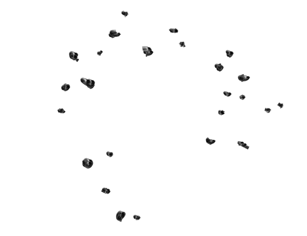
SMOTE requires that you start with some existing data. Let's say your data is a jumble of points, like this:
What SMOTE does is provide you with a simple set of rules to generate new "synthesized" data. Here's how it works (and you can click on any of these whiteboard drawings to see the full-sized version):
1. From all your data points, pick 1 random point. Call this your "home".
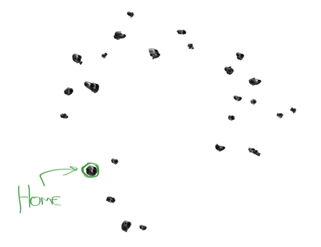
2. Find the 5 data points nearest to your home. Call them the "neighbors".
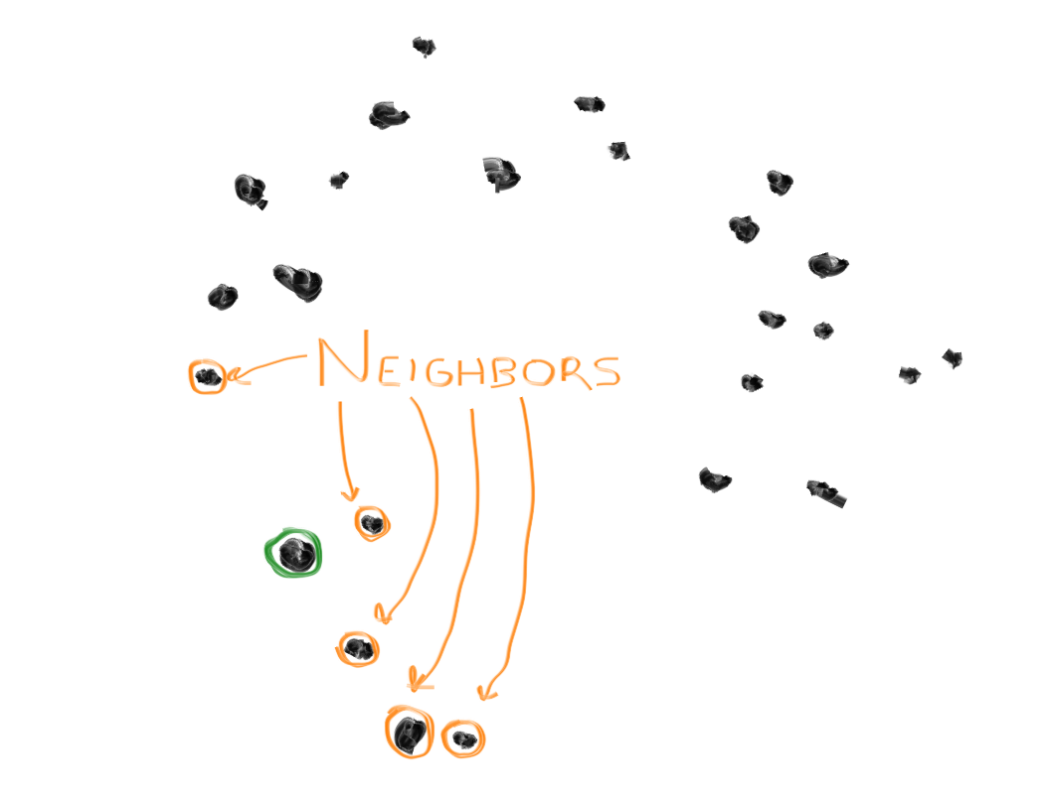
3. Pick one of the neighbors randomly, call this the "friend".
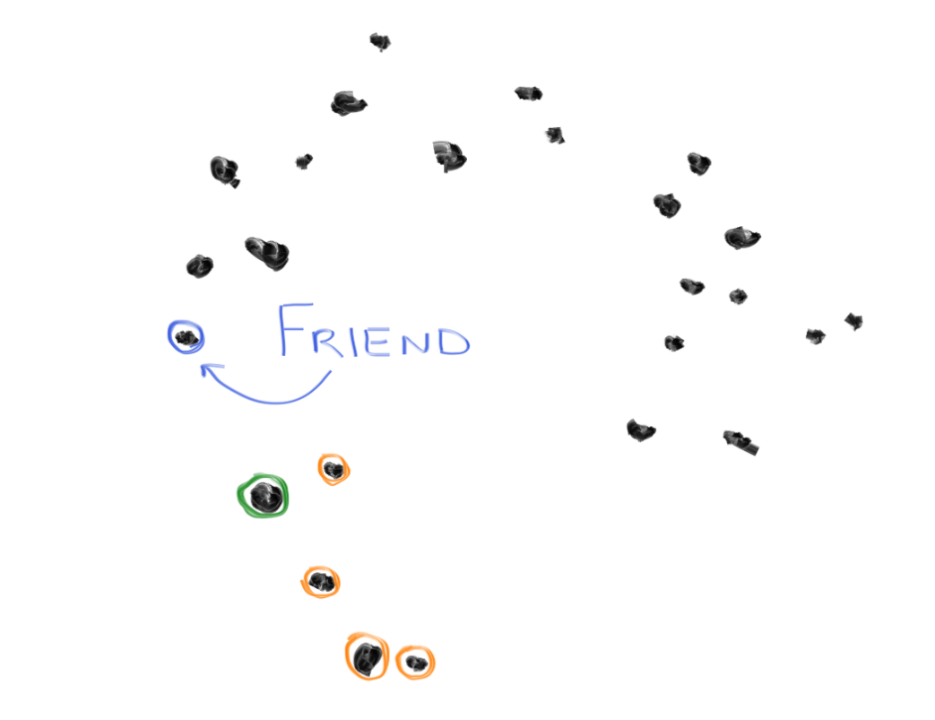
4. Draw an imaginary line between the home and the friend.
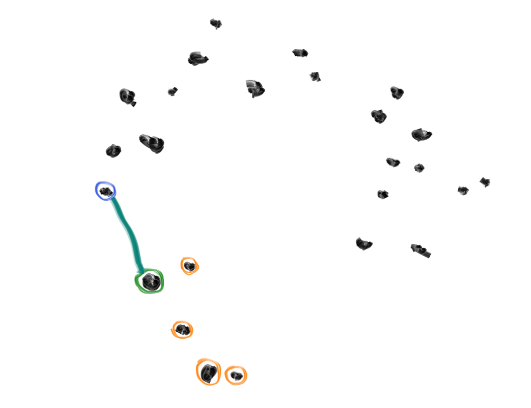
5. Pick a random point somewhere along the line, and call this your "seed".
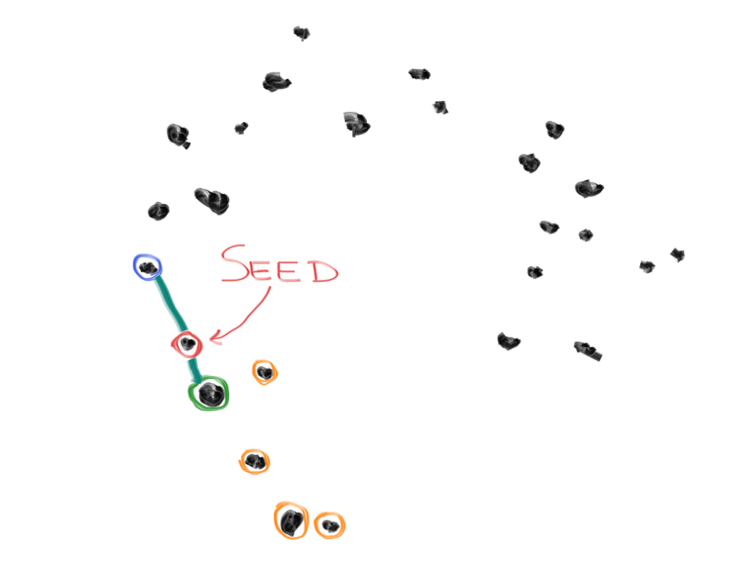
6. Add the seed to your original data points, and start the process again.
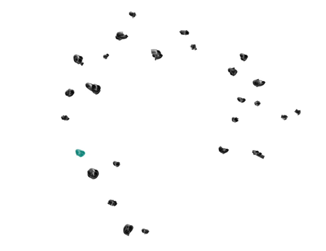
Because you've added the seed to the to original data points, the next time you run through those rules, the seed may be used as the "home" or as one of the neighbors. And as you continue on, adding more and more seeds, SMOTE fills the space with points, but never creates points outside of the original data:
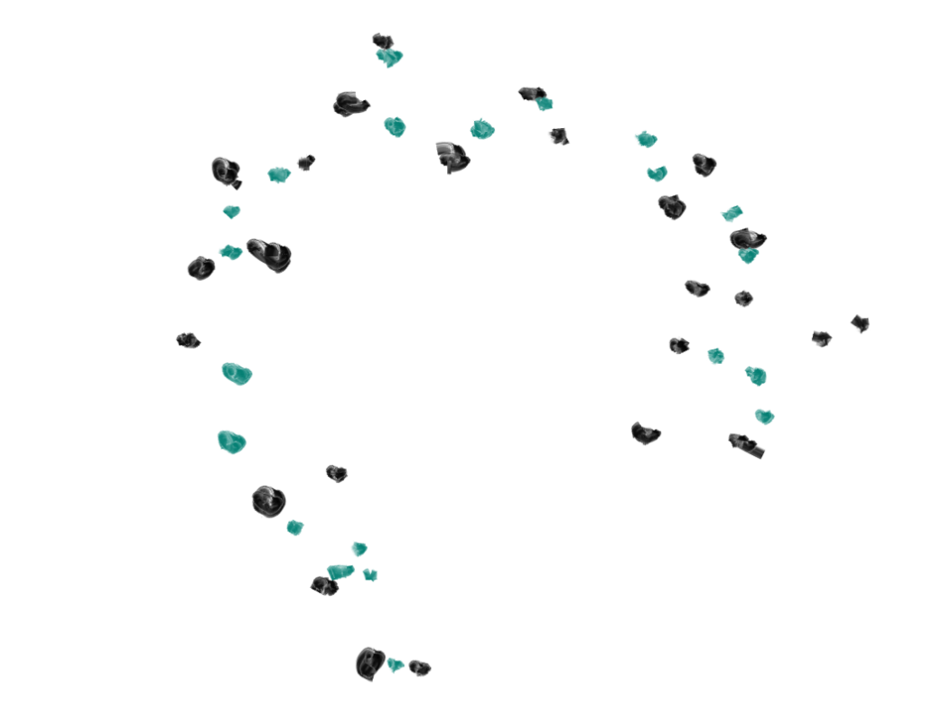
Is 5 A Magic Number?
Pretty cool, right? Visually, it reminds me a little of something I wrote about constellations.
In their podcast, Ben and Katie raised an interesting question: Why 5 neighbors? Why not fewer? Why not more? What makes 5 special?
Now that we've got the visuals, let's see if we can answer those questions.
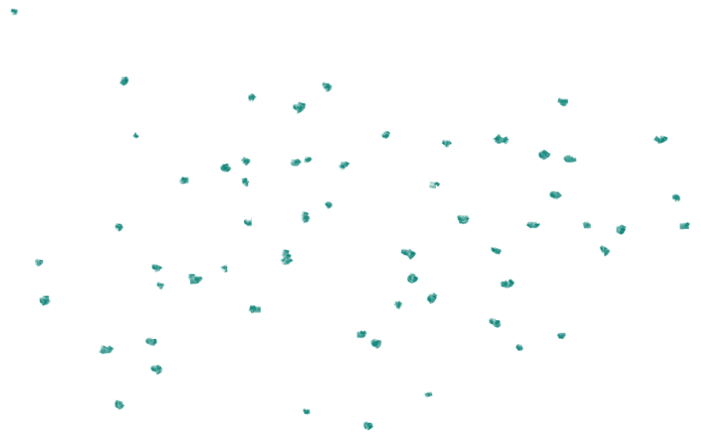
SMOTE-ing Real Data
Here are some new points. These points actually correspond to something in the real world, but we don't know what that thing is (yet).
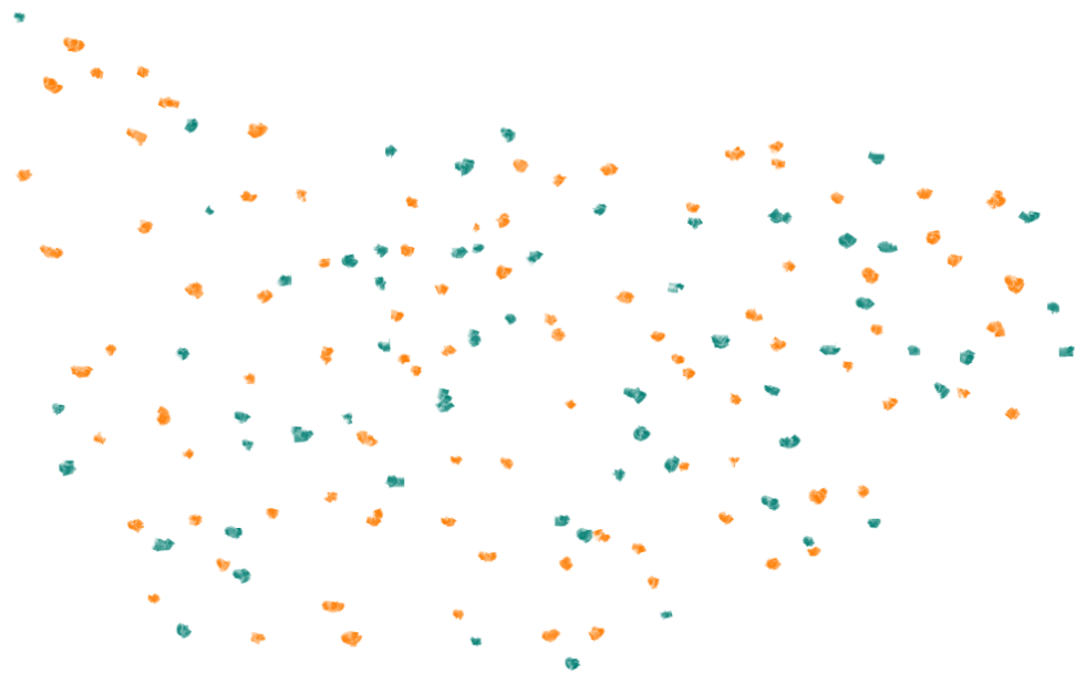
Now, let's apply the SMOTE rules to this data. We'll try doing it with 2 neighbors (the red dots on the left), and with 10 neighbors (the orange dots on the right):
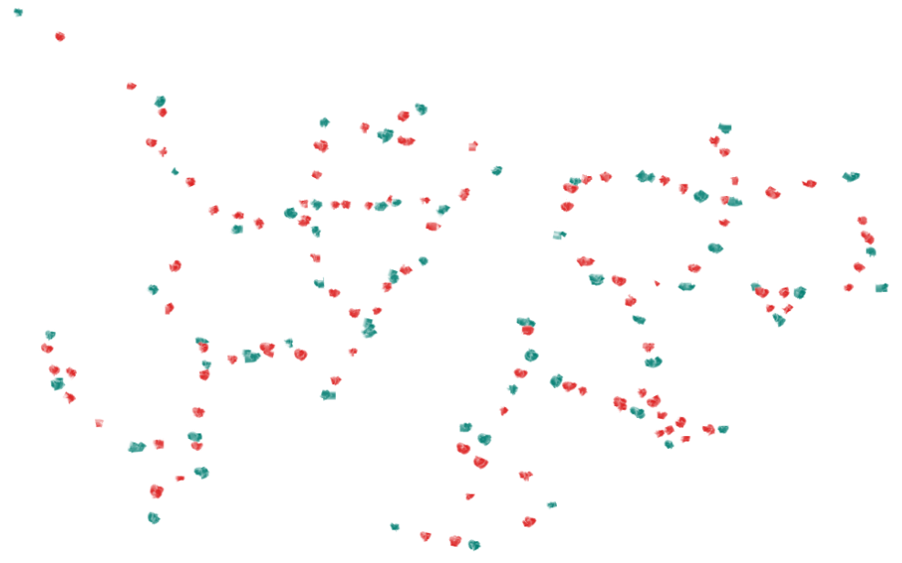
When we pick a smaller number of nearby neighbors, our synthesized points tend to form more, smaller clumps. In fact, with only 2 neighbors, those clumps tighten into trails.
When we pick a larger number, the synthesized points tend to form fewer, larger clumps.
(The density of the original data also plays a role here, but that's a math-ier topic than I want to get into right now.)
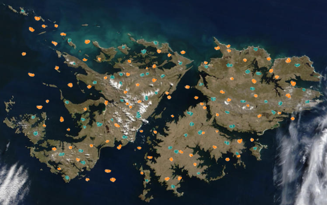
Depending on the source data, you might want tighter clumps, or you might want broader clumps. Let's take a look at what the original data actually represents (as always, click to embiggenate):
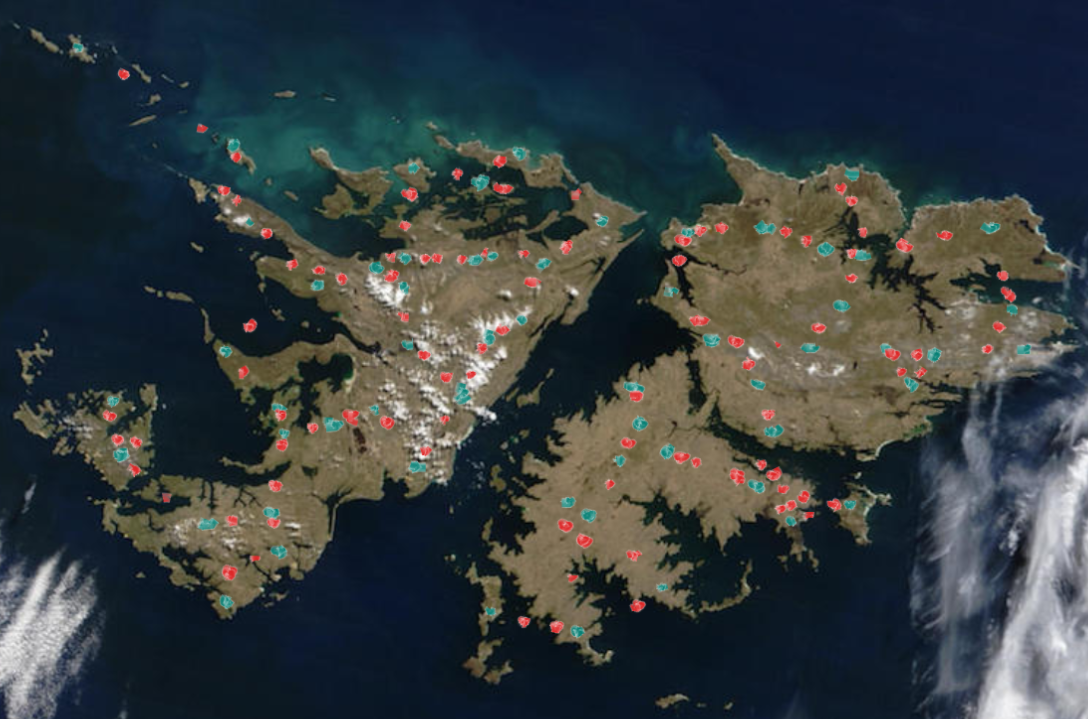
This is a satellite image of the Falkland Islands, courtesy of the Visible Earth project at NASA. This is also the photo of amazing coastlines I promised you at the beginning of this post... check those out!
Clumping Conclusions
The Falklands are made up of two main islands spaced relatively closely given their sizes, plus a slew of tiny islands scattered around them.
There's an argument for using more neighbors because the data mainly represents the two islands (or two data clumps, depending on how you like to look at satellite imagery).
However, there's also an argument for fewer neighbors (more, smaller clumps)... not only because of the small islands scattered around but also because the coastline is incredibly complex. With bigger clumps, it's easier for your new synthetic points to end up in a bay or between islands.
So, when you're using SMOTE, the number of neighbors you consider becomes a tunable parameter that you can adjust based on the type of data (and the density of data) you're starting with. Which leads us to an important rule of thumb of data science: The more you know about what your initial data is, the better you're going to be at using it.
Final Notes
I'd be remiss if I didn't mention the original SMOTE paper, written by Nitesh V. Chawla, Kevin W. Bowyer, Lawrence O. Hall, and W. Philip Kegelmeyer. (And my apologies to that adept team if I did a poor job of explaining their very cool algorithm!)
Do you have any podcasts you like, especially ones that could benefit from a few simple sketches? Please let us know at @LimnuApp!