How our designer uses Limnu
There's a term in software development called "dogfooding". It sounds weird, but all it means is that you use the software that you write, as in "eating your own dogfood". At Limnu, dogfooding isn't a problem because communicating visually is kind of our thing.
A lot of the design you see in Limnu is from a team called Sawaya Consulting. We love their work, but also love how they use Limnu. Here are some examples of how they've used Limnu for themselves and their other clients.
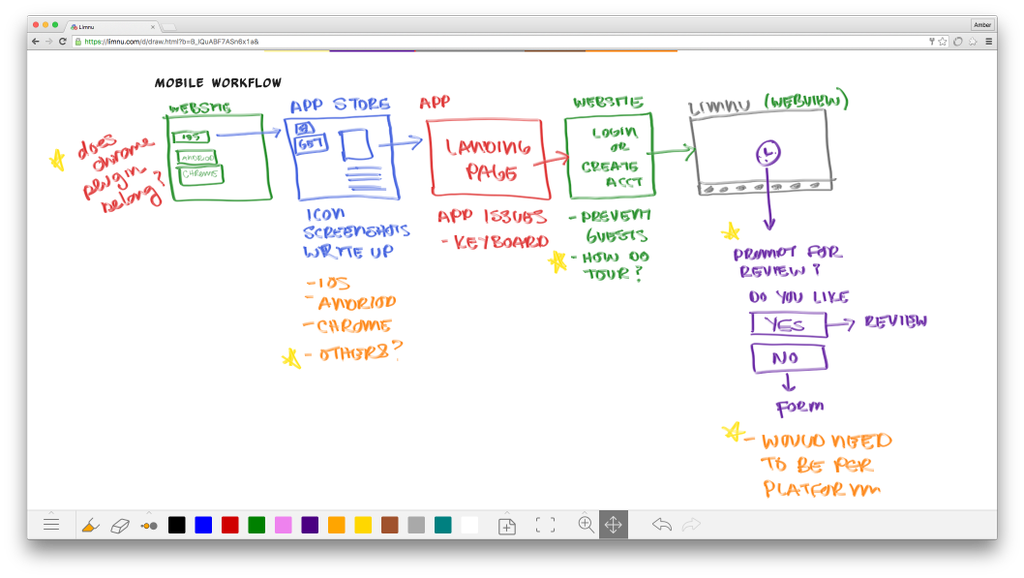
UX Flow
When you're working out the paths a user can take through your app, it helps to draw it out like a map. It's called a User Experience Flow Diagram, or UX Flow for short. Early in the process, you want a tool that lets you work quickly, and doesn't bog you down with lots of tricky design tools. In other words, a Limnu whiteboard is perfect! Here's the UX flow from part of a mobile app that Sawaya Consulting has been working on.
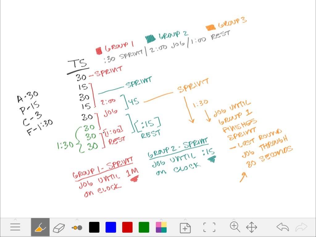
Wingate Sprints
If you've got a bunch of sequential tasks, a "To Do" list is fine. But when those tasks have timers, and overlap, and repeat, and are nested, you really need to be able to sketch it. Here's the exercise schedule for a gym class that Amber at Sawaya Consulting did, because you really shouldn't spend all day at a keyboard!
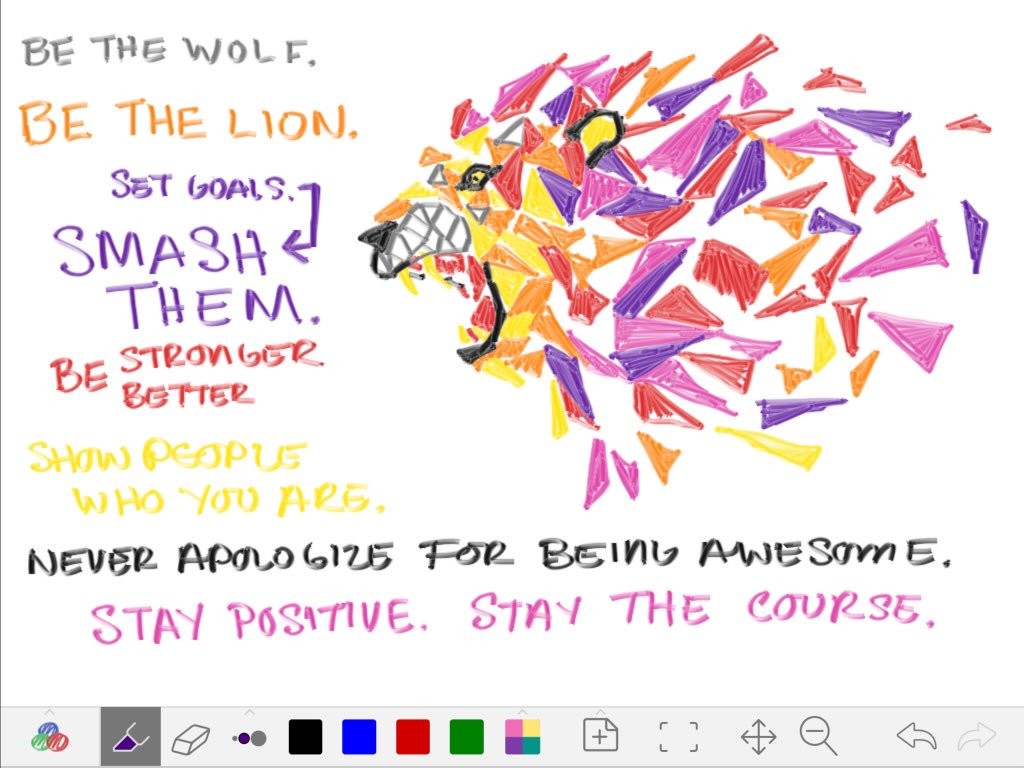
Just Drawing
Designers gotta design. Amber found a quote she liked, and just started drawing.
What Have You Drawn?
Do you have any Limnu sketches you'd like to share? Send them to limnu@limnu.com or tweet them to @LimnuApp with the hashtag #MadeWithLimnu and we might feature them on the blog or the website!


